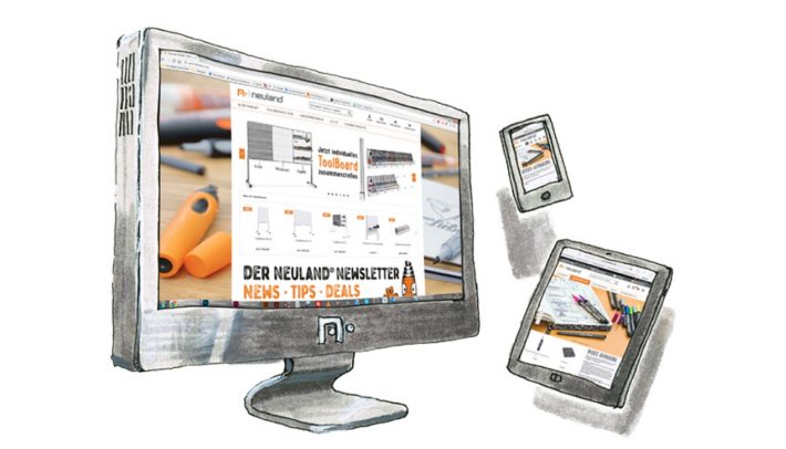
Recently, we have been asked several times whether we could specify “hexadecimal values” for the color shades of our markers. If you do not know right away what is meant by this, you are probably not a web designer. As with printing, it is equally important that selected colors on a screen are being displayed authentically and reliably, e.g. for a website.
For this reason, a standardized naming of these colors has been developed for Screendesign. Do not worry, this will not turn into a specialist-seminar.
If you want to know more, we invite you to read the relevant article at wikipedia. Here‘s only so much – or so little – for Hex-Codes:
Yes.
Yes, we will specify the hexadecimal value for each Neuland color, and specify which would be closest to it, if it were a screen color. This is not so easy, as the experience on paper shows: For example, if we print the CMYK basic colors cyan, magenta and yellow on very smooth, high-white paper, they still quite correspond to the standard tones from the printer color tube.

However, each paper is differently absorbent and also the “white” of the paper can sometimes be colder, warmer, darker or really bright white. You can see this when printing.

Exactly the same applies to our marker-inks. On white they radiate and are still quite close to a printing result.

On gray, absorbent paper, which is even turning wavy when applied with moisture, it already looks a bit different.

This means: Our hexadecimal color table will surely be of help, but the values can only be approximate. We apologize for that – a little bit.
Because: Do web designers really believe that every monitor in Germany and the world is precisely calibrated color-wise? The two monitors, which I have here in front of my eyes, show at least a minimally different brightness. Plus, on one the contrast is much stronger. The other is a bit reddish. Even with an exact color coding it is not certain whether a chosen color will later be displayed to the viewer exactly as the designer imagined.
One can regret that.
Even more so we want to enjoy that not everything is predictable. And that mostly the unplanned drawing with markers leads to the most beautiful result.
In this sense: have fun.